When You Decide You Hate Your Cover Design
Fun fact: writers are great at procrastination. I dragged my feet a little in finishing the formatting of my ebook, so when I finally lit a fire under my own rear end and applied for the ISBN, I landed myself in another waiting game. What I didn’t know is that there’s a 20-day waiting period for the ISBN Canada application to be approved. These days of waiting have left me with little else to do besides stare at my cover design and hate it more with every passing moment.
I am not a designer, nor am I in a financial position to pay for one at the moment, because my life for the past two years has been rather like a bad country song. I do, however, have an idea of what looks good design-wise and what looks awkward. Just like writing, it’s easy to become blind to your own work. This is where friends come in handy for feedback, if you have them.
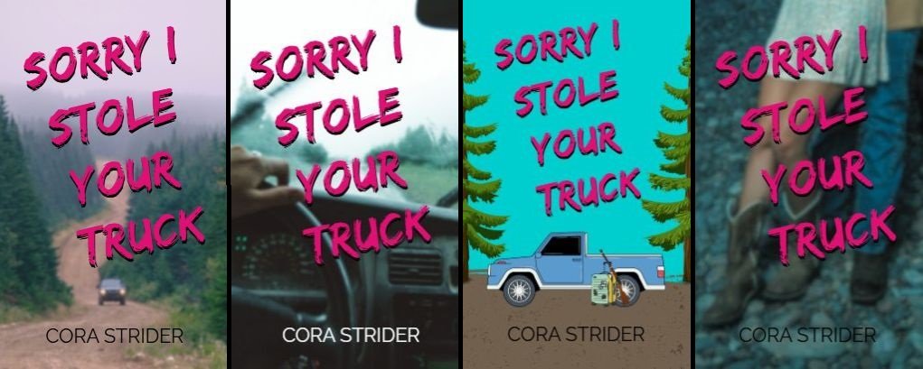
The Original Cover Design
A dirt road winding off into the distance was supposed to convey the rural setting and a sense of going somewhere remote. Like my main character, Cedar, does. The font is meant to be a written scrawl, with the pink colour like lipstick.
The Problem
The more I looked at it, the more I wondered if it actually does convey women’s fiction and romantic comedy. Women’s fiction covers are typically a little muted in tone with real-world elements, and romantic comedy covers are usually sassy and fun, bright and illustrated.
What it Needs
First off, it needs to be brighter in tone. Right now, it looks more like a thriller or mystery. Secondly, it should have a focal point that says something about the story. Since the story is a mix of shenanigans with serious subject matter woven through it, the cover also needs to portray this, and it has to be eye-catching enough that it will sell.
Small-town tomfoolery is a fairly difficult thing to signal on the cover, but fun is easier. I also want to convey that it’s rural. It’s also romantic. So fun, rural, romantic. Bright colours.
I’m also not one hundred percent sold on the font. While I do think it needs something that looks handwritten, I’m not convinced that more cursive fonts are the way to go. I want something handwritten, a bit textured, and a little chaotic. Above all, it has to be legible. I love nothing more than eyeballing fonts for hours, so playing around with that won’t be much of a problem.
Mission Impossible?
Since I’m confined to free image sources due to budget constraints, finding an image that’s fun, rural, and romantic that doesn’t contain identifiable people (How weird would it be to see a stock image of yourself on some random book cover?) has proven to be quite the challenge. I’ve found a few that kind of work, but I’m not sold on them.
My biggest problem with photos containing a woman to portray my main character is that there is an inordinate amount of women in stock photos who just simply aren’t wearing pants. Look, I love dresses, and the images are beautiful, but my Cedar would one hundred percent be in jeans. She wouldn’t be prancing through a field in a dress, as gorgeous as that would be. Love interest Lucan, in turn, wouldn’t be in city boy shoes. He’d be strolling around town in worn work boots. Do you have any idea how hard it is to find a free photo of a guy in work boots?
With no other options, I’ve endeavoured to teach myself photo editing skills. My experience thus far with photo editing has been on Microsoft Paint (I love MS Paint.) On the bright side, I’m a perfectionist.
Wish me luck.